
Components
Every component below is injected into .md/.mdx content automatically - no import statement needed anywhere in this file, or any other page in this site. This page exists purely to demonstrate each one; see Introduction and Quickstart for the same components used in actual context.
Callout
Five variants, for different levels of urgency, each with an optional title:
A note - background information that’s useful but not critical.
A titled info callout, written the long way - <Callout type="info" title="...">. The shorthand <Info title="..."> right below renders identically.
Same callout, shorthand form - <Info title="..."> instead of <Callout type="info" title="...">.
A tip - a suggestion that makes something easier or faster. This one has no title, so the icon sits inline with a single line of body text instead of a bold heading line above it.
A warning - something that could cause a problem if ignored.
A danger callout - reserved for destructive or irreversible actions.
<Callout type="info" title="Two ways to write this">
  The long form.
</Callout>

<Info title="Two ways to write this">
  The shorthand form - identical result.
</Info>type is one of "note" (default), "info", "tip", "warning", or "danger". Every type also has a same-named shorthand component - <Note>, <Info>, <Tip>, <Warning>, <Danger> - which is just <Callout type="..."> under the hood, so pick whichever reads better in a given file. title is optional on both forms.
Card and CardGroup
Card links to a page (or renders as a plain, non-clickable block if href is omitted) and shows a title and short description, plus one of three optional headers: an icon, a full-width img, or an API-style method badge. CardGroup arranges its children in a responsive grid, cols wide:
Bare Lucide icon
icon="server" - resolved against the Lucide set by default.
Iconify pair
icon="simple-icons:github" - a collection:icon-name pair resolves against that Iconify collection instead.
Literal emoji
Anything else - an emoji or symbol - renders as literal text.
No icon at all
Omit href and the card renders as a <div> instead of a link - still useful purely for the icon+title+description layout.
<CardGroup cols={2}>
  <Card title="Quickstart" icon="🚀" href="/docs/core/2026-01/guides/quickstart/">
    Get an API key and make your first request.
  </Card>
  <Card title="Authentication" icon="🔑" href="/docs/core/2026-01/guides/auth/">
    How API keys, scopes, and token expiry work.
  </Card>
</CardGroup>Set img instead of icon for a full-width image above the title:

Image card
img takes priority over icon if both are set - useful for a screenshot or illustration instead of a small glyph.
<Card title="Image card" img="/images/light-background.svg">
  Renders full-width above the title.
</Card>Set method for an API-reference style card - a solid, colored badge next to the title (GET/POST/PUT/PATCH/DELETE, any other value renders gray), same color set as the sidebar’s own OpenAPI method badges:
<Card title="Get widgets" method="GET" href="/petapi/widgets/get-widgets/">
  List every widget in the store.
</Card>Tabs and Tab
Switches between mutually-exclusive content - one visible block at a time, useful for the same instruction shown across multiple package managers, languages, or platforms:
npm install @acme/core-sdkpnpm add @acme/core-sdkyarn add @acme/core-sdk<Tabs>
<Tab title="npm">
```bash
npm install @acme/core-sdk
```
</Tab>
<Tab title="pnpm">
```bash
pnpm add @acme/core-sdk
```
</Tab>
</Tabs>Tabs itself takes no props; Tab’s only prop is title (required) - the label on its clickable pill.
CodeGroup
Groups two or more fenced code blocks into a tabbed interface, switching between them the same way Tabs does - one visible at a time. Each fenced block’s own title="..." meta becomes its tab label; with no title, the block’s language is used instead:
import { Core } from "@acme/core-sdk";

const client = new Core({ apiKey: process.env.ACME_API_KEY });curl https://api.kitchen-sink.example.com/v1/widgets \
-H "X-API-Key: $ACME_API_KEY"import acme
client = acme.Core(api_key="...")<CodeGroup>
```js title="index.js"
import { Core } from "@acme/core-sdk";
```
```bash title="cURL"
curl https://api.kitchen-sink.example.com/v1/widgets
```
</CodeGroup>A single-block CodeGroup renders as one plain bordered block with no tab strip:
npm install @acme/core-sdkAccordion and AccordionGroup
Good for FAQs or optional detail that shouldn’t take up space by default:
Is this a real API? #
No - every endpoint and response shape in this fixture is illustrative, meant only to exercise writedocs’ own components.
Can components nest inside each other? #
Yes - see Quickstart, where Tabs/Tab and CodeGroup both live inside a Steps/Step sequence.
Do components work inside snippets too? #
Yes - a reusable .mdx snippet gets the same automatic component injection as an ordinary page. See the pro-tip callout at the bottom of Introduction for a live example.
<AccordionGroup>
  <Accordion title="Is this a real API?" icon="circle-help">
    No - every endpoint and response shape in this fixture is illustrative.
  </Accordion>
</AccordionGroup>title is required - and, like Callout/Card/etc., becomes a linkable #slug anchor automatically, deduped against every other titled element on the page. icon is optional (resolved the same way as Card’s own icon prop); omit it and the row lays out exactly as before. AccordionGroup takes no props - it’s a spacing wrapper that also unites its children under one shared border (see above).
Steps and Step
Numbered, connected steps for sequential instructions:
Write
Create or edit an .mdx file under docs/ - or, as this fixture shows, anywhere else in the project.
Preview
Run writedocs dev and check the change in your browser - edits to content or docs.json apply without a server restart.
Ship
Run writedocs build and deploy the resulting dist/ folder to any static host.
An untitled step renders its content with no bold heading line above it:
title is optional on Step - this one has none.
This one has a title
Mixing titled and untitled steps in the same Steps sequence is fine.
<Steps>
  <Step title="Write">
    Create or edit an `.mdx` file under `docs/`.
  </Step>
  <Step title="Preview">
    Run `writedocs dev` and check the change in your browser.
  </Step>
</Steps>Steps itself takes no props; Step’s title prop is optional.
Hint
An inline, dotted-underline span for a short aside — hover or focus to reveal a one-line tooltip, without breaking up a sentence into its own block the way Callout does:
Widget IDs are globally uniqueA v4 UUID, e.g. 3fa85f64-5717-4562-b3fc-2c963f66afa6 across every store.
Widget IDs are <Hint tip="A v4 UUID, e.g. 3fa85f64-5717-4562-b3fc-2c963f66afa6">globally unique</Hint> across every store.tip (required) is the tooltip’s plain-text content. Unlike every other component on this page, Hint is inline - meant to sit mid-sentence, not on its own line.
Image
Centers an image, rounds its corners, and constrains its width to size at full screen - still shrinking normally on a narrower viewport. Set srcDark alongside src to swap in a different image for dark mode:


<Image
  src="/images/light-background.svg"
  srcDark="/images/dark-background.svg"
  size="70%"
  alt="A background illustration that swaps with color mode"
/>src is required; srcDark, size (a CSS width, default 100%), and alt are all optional - omit srcDark and src renders in both color modes.
Set caption and the image gains a bordered, rounded card background - inset inside it, with the caption centered underneath, inside the same card:
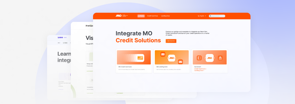
<Image
  src="/images/component-demo.svg"
  size="70%"
  alt="Widget dashboard mockup"
  caption="Widget dashboard preview, in light mode"
/>caption is optional - omit it and the image renders with no card background at all, exactly like before this prop existed.
Frame
Wraps existing markup - a raw <img>, a markdown ![]() image, a <video>, an <iframe> embed, anything - in a bordered, rounded card, with an optional caption inside that same card. Unlike Image, Frame has no src/size/dark-mode props of its own - it just frames whatever’s already there:
<Frame caption="A framed image, with a caption">

</Frame>caption is optional - omit it and the frame renders with no text underneath, just the bordered card around whatever’s inside it.
Video
Renders src as either a native <video> or an <iframe> embed, auto-detected - no separate prop to pick one. A src ending in a recognized video file extension (.mp4, .webm, .ogg, .mov, …) gets a real <video controls>; anything else (a YouTube, Vimeo, or Loom embed URL) gets an <iframe>. Same card language as Image/Frame - same border-radius, same optional caption inside a bordered card:
<Video src="media/paylink1.mp4" width="500px" />

<Video src="https://www.youtube.com/embed/dQw4w9WgXcQ" width="500px" />src is required; width (a CSS width, default 100%), caption, controls/autoplay/loop/muted (only apply to the <video> case), and title are all optional.
Parameter and Expandable
Parameter renders the name/type/description row used on API reference pages; Expandable wraps a nested set of them behind a “Show/Hide” toggle, for a nested object’s own properties:
<Parameter name="user" type="User Object">
  <Expandable title="properties">
    <Parameter name="full_name" type="string">
      The full name of the user
    </Parameter>
    <Parameter name="is_over_21" type="boolean">
      Whether the user is over 21 years old
    </Parameter>
  </Expandable>
</Parameter>Parameter takes name (required), plus optional type (renders with no type badge if omitted), required (shows a red “required” label), and default (shows a “default: …” label). Expandable takes an optional title (default "properties", used to compute its “Show X”/“Hide X” toggle label) and defaultOpen (default true).
Plain Markdown still works
Every component above is additive - regular Markdown (lists, tables, blockquotes, links, bold/italic, inline code) works exactly as expected with no wrapper needed. This page covers the twelve built-in components; Introduction additionally shows a Mermaid diagram and KaTeX math on the same page as Callout/CardGroup/AccordionGroup, and its own MDX/React snippet imports - features that aren’t components themselves, but are just as available with zero setup.